|
|
|
  |
 |
 |
 |
 |
|
|
Reverb |
||
|
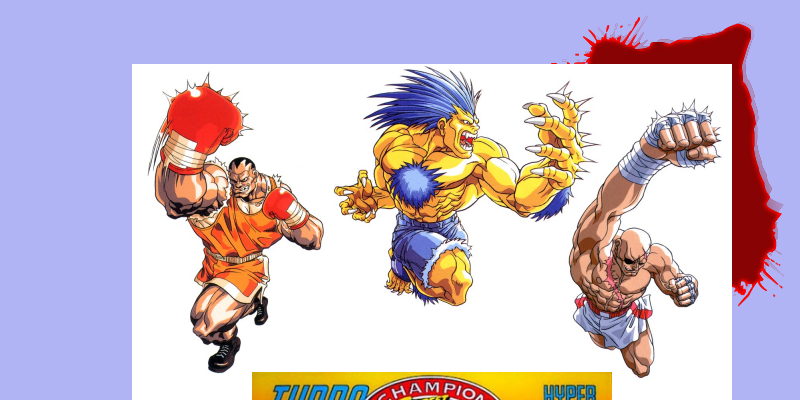
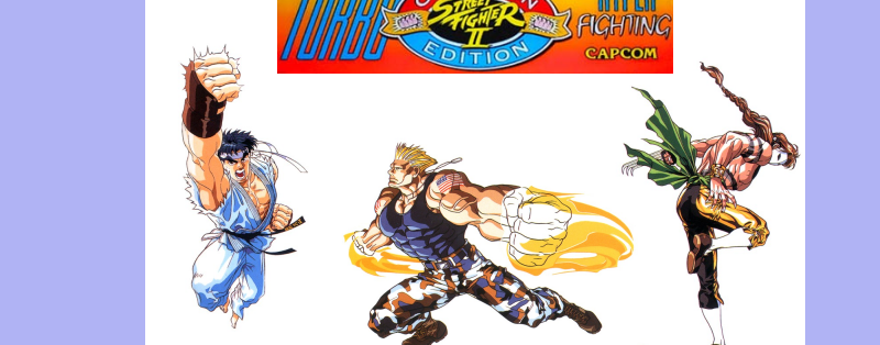
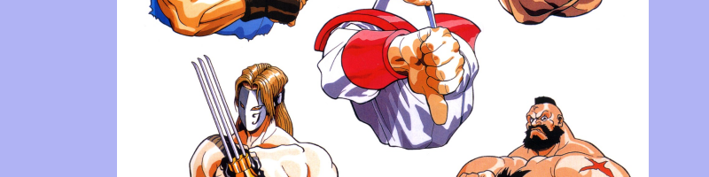
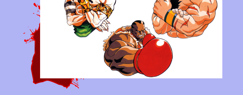
This was incredibly disappointing, considering SFIIT has the best artwork to ever come out of Capcom. Yes, better than Final Fight, Final Fight 2, Street Fighter II - The World Warrior, Street Fighter II - Champion Edition, and Saturday Night Slammasters! That's right, the best illustrations Capcom has ever made were for SFIIT, and for the most part, they have gone unrecognized by most "fans." In the end, I was happier about SFIIT being re-mastered in HD not just for the preservation of a timeless classic, but for the preservation of the masterful artwork that timeless classic was promoted with and built upon! I won't lie; the first time I ever saw the incredible official (Japanese) artwork for Capcom's fighting blockbuster, Street Fighter II - Turbo: Hyper Fighting, it was in EGM. It was an SNES preview for the pending consumer home release of the arcade smash, and the artwork featured in it had me more hyped than the screenshots of the game itself! That preview is a testament to what EGM once was (before EGM was overrun by frat-boys). I could go on for pages about how EGM consistently made it a point to feature less and less artwork in the coming years after that, but this article is more importantly about the incredible artwork that Capcom designers Kinu Nishimura and Bengus worked together on to promote Capcom's mega-hit... |
||
     |
||
| A
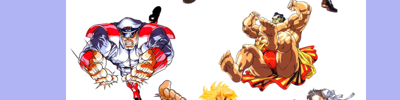
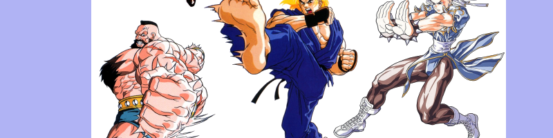
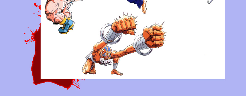
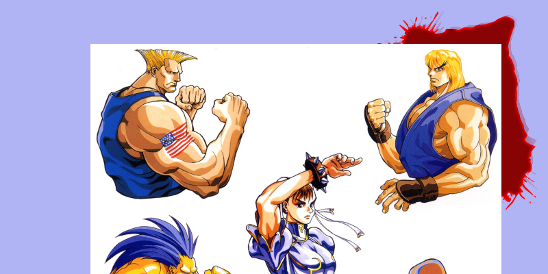
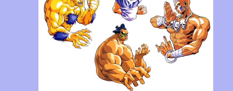
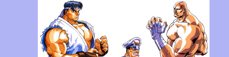
Diamond... It portrays each of the World Warriors in unrivaled ferocity when you compare it to any other official Street Fighter artwork, but it's also saddening. Not in any part due to artists Kinu Nishimura and Bengus or their abilities, but more from how their incredible collaborative effort seems to go unnoticed by "fans." I know Capcom didn't use his amazing artwork at all for any American version of Street Fighter II Turbo, so it could have gone unnoticed because of that. But, still, there's no excuse! No excuse for older "fans" from before the Internet onslaught because even if Capcom USA snuffed the amazing art Bengus made for the game, EGM did feature his work in their preview. Younger "fans" have no excuse, either, because they didn't have to see it in magazines at stores, or at then-rare import game shops to know it existed; official artwork for nearly every Capcom title has been readily-available on the "Inturwebz" for the last ten years now. Save for certain Resident Evil 2 and Resident Evil 3: Nemesis pieces, official (non-sketch) Capcom design artwork originally compiled in licensed Japanese "mooks" is much more accessible now (on the web) than before. And this lack of appreciation is even amidst the stride of its immensely-successful HD re-release for Xbox Live (making it all the more disappointing). Why Capcom USA opted for the clearly inferior "realistic" box-art and older Champion Edition illustrations for SFIIT over the superior Kinu Nishimura/Bengus artwork is beyond me, but even more disappointing is the lack of enthusiasm "fans" have shown for it. Kinu Nishimura and Bengus didn't just illustrate Street Fighter II - Turbo: Hyper Fighting; they captured the very essence of each character and what makes them unique and appealing. Each character is alive and furious in your face, blazing with a signature move (just like in the heat of the game). Hit sparks, action lines, and trailing effects (like fire) combine with rippled clothing for the most extreme artwork in the series. They really look like they're wrecking house just like in the game; the blinding speed of Ken's Hurricane Kick, the sense of depth with Ryu's Dragon Punch, Guile's blazing Sonic Boom, the heat of her Fireball can be seen on Chun-Li's face, the sense of depth in E. Honda's crushing Sumo Press descension, Dhalsim's lethal range, Blanka's ferocious swipe, Zangief's monstrous Lariat, the tuck of Balrog's devastating Dashing Uppercut, Vega's agility, Sagat's vengeful Tiger Uppercut, and M. Bison's mysterious Flaming Torpedo are all flawlessly illustrated. |
||
     |
||
|
...In
The Rough |
||
| Lost
Legacy Lots of games have artwork that gives a glimpse into a character, but few give you a glimpse of the game's world and/or universe through the character. SFIIT's intense character illustrations tell as much about the game as full portraits with backgrounds for other games. At the time, SFIIT once again pushed it to the threshold with its speed and midair moves, blazing another path for others to follow, and its illustrations show it. I think they did the same thing by setting the bar higher for illustrations, too. I have seen few illustrations for any game that are as memorable as the ones for SFIIT. Why? Because they are memorable. The SFIIT illustrations featured the cast of the game doing familiar moves in loud, unforgettable colors that made a long-lasting impression. Only SFIV's illustrations come close to SFIIT's, but don't surpass them simply because some characters aren't depicted doing anything special. In retrospect, it would have made SFIIT's HD digital re-release so much cooler if they had redid the selection and VS screens using the game's own official artwork. The artwork was way ahead of its time, and would have matched everything for the HD re-release well. Maybe in the future we'll see them make that move on another re-mastered version of SFIIT... |
||
| - BAD | ||